Eman – Symbols intertwined
Premium interconnected

“Simplicity is the ultimate sophistication” – a wise man once said. While we’re not nowhere near DaVinci’s genius, we are pretty good at making beautiful foundations for the upcoming businesses.

Our client from the export-import world had an inquiry of making a logo that would represent close ties between those two branches. Also, it was supposed to be a token of Italian/Montenegrin relationship, since its consumer goods come from the cradle that have spawned DaVinci in the first place.

Enter – Eman Montenegro. Or how we see it – eman MONTENEGRO.

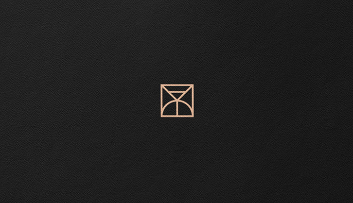
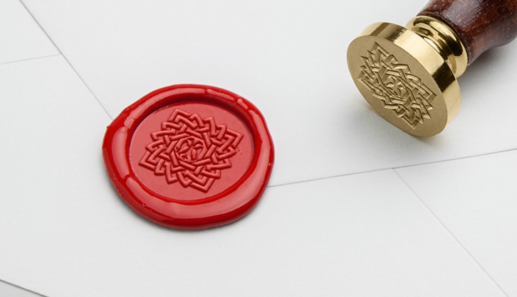
Our designers came up with a combination mark of unorthodox lower and upper case letters and intertwined symbols representing aforementioned request from the client.

Term – premium has been embedded in the whole idea of moving things across Mediterranean. eman MONTENEGRO’s mission is to provide its customers with high-end quality products. And they had the same expectations for our design department.

So far, we’re good. Logo was created by binding two “e” letters that suggest unity and security. It is solved as a striking form, applicable on all surfaces. Small and the big ones. Typography is solved by using modern serif with the aim of achieving elegance and contrast between the minimalistic form of sign and logotype.


Like what you see?
Let's talkOther cool projects
We are using cookies to ensure you get the best experience on our website. You consent to our cookies if you continue to open pages. More details.
